The rule: dark modules, light background
Scanners look for dark squares on a light background. The classic black on white is the safest. You can use colour, but the code must stay clearly darker than its background. Inverted codes (light on dark) fail on many scanner apps.

A colourful example, tested
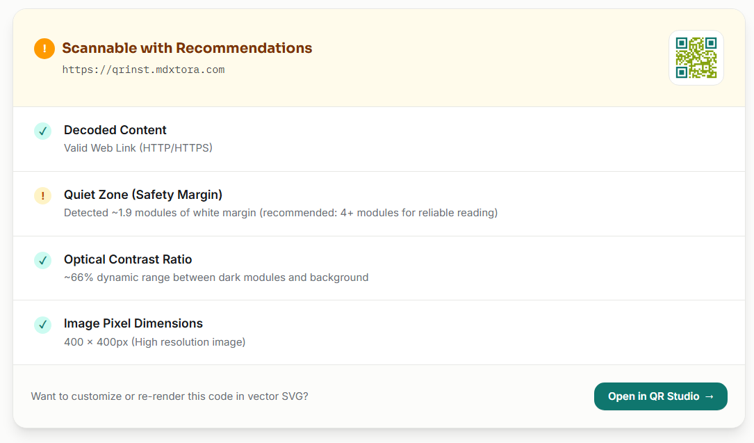
Here the finder squares are teal and the data modules olive green. It looks friendly, but the olive is noticeably lighter than black.

Uploading it to the QR checker gives a useful answer. It decoded the link and measured about 66% contrast, which passes, but it still returned Scannable with Recommendations because of a margin warning. That is the point of testing rather than guessing.
Practical tips
- Keep every module darker than the background, not just the corners.
- Avoid light grey, yellow or pastel on white.
- Keep the white margin around the code; do not place colour right against it.
- Print colours look different from screens, so print a proof and scan it.
- When in doubt, go darker. See why a QR code is not scanning.
More guides
- What size should a printed QR code be?
- How to make a Wi-Fi QR code guests can scan to connect
- QR code not scanning? 9 common causes and fixes
- How to make a QR code menu for your restaurant
- How to put a vCard QR code on your business card
- Static vs dynamic QR codes: which one should you use?
- How to make a WhatsApp QR code that opens a chat
- Are QR codes safe? How to spot and avoid malicious codes
- How to add a logo to a QR code without breaking it
- PNG, SVG or PDF? Which QR code file format to download
- How to track QR code scans with UTM links
- How to make an email QR code with a pre-filled subject and message